(c) Disney – h/t Inside the Magic
The Magic of Simplicity: Disney and Universal Studios
Reflecting on the best billboards around Orlando, particularly those by Disney and Universal Studios, we see a pattern of simplicity. During the park’s opening of the Wizarding World of Harry Potter, Universal Studios billboard often featured just an image of Harry Potter, their logo, and a straightforward message. Similarly, Disney displayed an Avatar character with the Disney’s Animal Kingdom logo and a simple message when Pandora opened. These billboards are effective because they’re clear and memorable, even with a quick glance while driving.

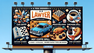
An AI-generated billboard for a lawyer, crammed with services. Didn’t want to use a real billboard, because of well, lawyers.
The Pitfalls of Complexity: The Overloaded Lawyer Billboards
In stark contrast, billboards crammed with information, like those of some lawyers listing every service, website, phone number, and more, often fail to communicate effectively. They’re cluttered and overwhelming, making it hard to comprehend the intended message at a glance.
Embracing the KISS Method in Billboard Design
Keeping it Simple, Stupid (KISS) is a mantra that holds significant weight in billboard advertising. The goal is to imprint one clear thought or message in the viewer’s mind.
Color Contrast and Visibility
A billboard’s impact heavily relies on its color scheme. Using high-contrast colors can significantly increase the visibility and readability of the content. For example, a dark blue background with bright yellow text not only catches the eye but also ensures that the message can be read quickly and from a distance.
Font and Readability
The choice of font is crucial. Large, bold, sans-serif fonts are often the most readable from a distance. The text should be sized appropriately, allowing for quick comprehension by someone driving by. Avoiding overly stylized fonts ensures that your message is accessible to a wider audience.
Message Hierarchy
Implementing a visual hierarchy in your design can guide the viewer through the content effectively. The most important element, like the main message or brand logo, should be the most prominent, followed by any secondary information. This hierarchy ensures that the viewer’s attention is drawn to what matters most.
Emotional Connection
Utilizing images or messages that connect emotionally with the audience can make your billboard memorable. A picture that tells a story or evokes a feeling can linger in the viewer’s mind long after they’ve passed by the billboard.
Contextual Relevance
Tailoring the billboard’s design to its location can enhance its effectiveness. A billboard in a rural area might use imagery and themes that resonate with the local audience, while one in a bustling city might opt for a more sleek, minimalist design.
Brand Consistency
Maintaining consistency with your brand’s visual identity on billboards reinforces brand recognition. This means using consistent colors, fonts, and styles that align with your overall branding strategy.
Testing and Feedback
Before finalizing a billboard design, it’s wise to test it in a simulated environment or gather feedback. This can reveal whether the key elements stand out as intended and whether the message is clearly communicated.
Do I Need to Put My Web Site on my Billboard?
This might be surprising, but no. If a billboard can cause people to remember your name, or even a unique tagline, then they can find you on Google.
Get a Start on Your Design!
By incorporating these principles into your billboard design, you can create impactful, memorable advertising that effectively communicates your message, all while keeping it delightfully simple. Want Biggest Bark to help design a billboard, social media graphic, or well, anything? Reach out today at 815 556 2525 or dtmulka@biggestbark.com.


